Google Summer of Code wrap-up!
Mobile/Responsive Design Implementation of p5.js Web Editor.
Mentored By Linda Paiste and Shuju Lin
Overview
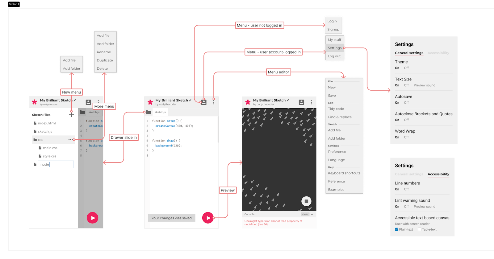
This project is dedicated to the enhancement of mobile responsive design implementations for the web editor. The existing editor, prior to this project, is not so usable on smaller screen devices such as mobile phones and tablets. The primary objective of this project is to rectify these issues, ensuring that the editor functions seamlessly on mobile devices. This improvement will allow users to effortlessly view, share, and edit their project code while on the move. In the following sections, I’ve structured this blog based on individual components, each having its Pull requests linked below.
Main areas of work
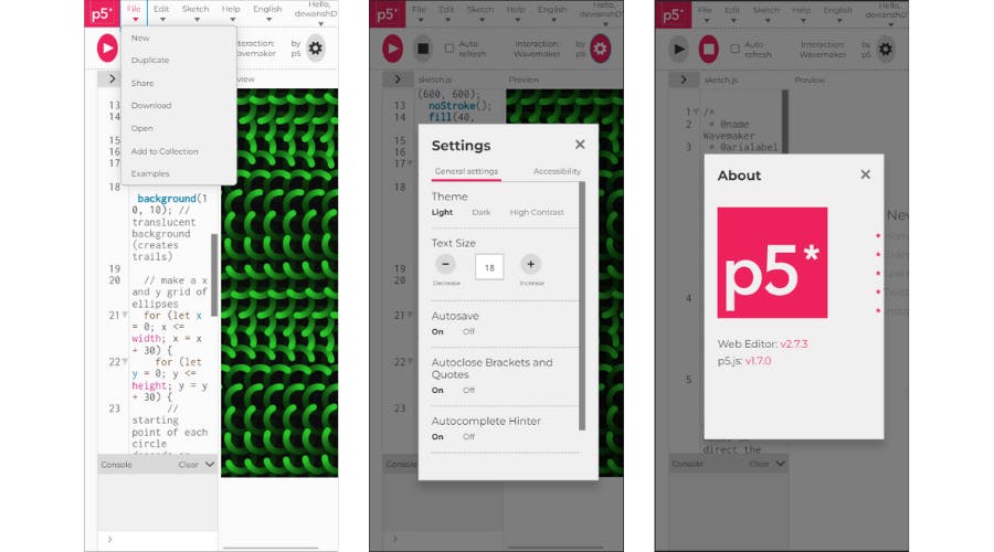
Previous editor on a mobile device
The Editor, The Preview, The SideBar and The Floating Action Button
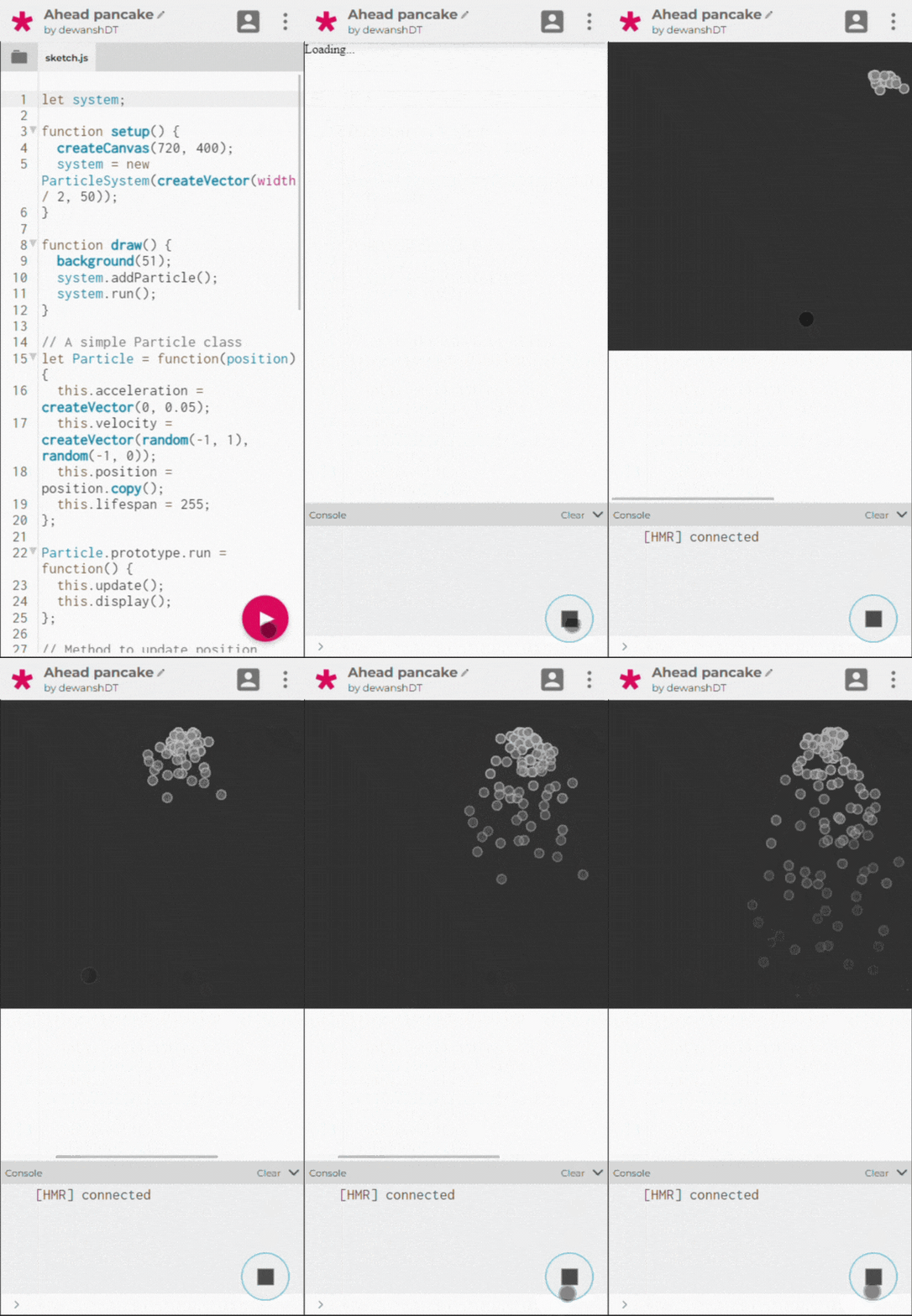
The current layout of the web editor displays the editor side-by-side with the sketch preview, which offers a good user experience on larger screens. However, it's essential to consider the usability of smaller screens. To address this, a responsive design approach has been implemented. When the screen size is smaller, it's more practical to display one component at a time. If the sketch isn't actively running, the screen will primarily show the editor alongside the collapsible file drawer. In contrast, when the sketch is running, the screen will prioritize displaying the Preview along with the console.
Moreover, the editor itself was previously implemented as a class component, relying on lifecycle methods for various functionalities, including the auto-save feature. Since some of the lifecycle methods are no longer supported I decided to convert the editor to a functional component and along with this me and Linda also improved the autosave logic as needed.
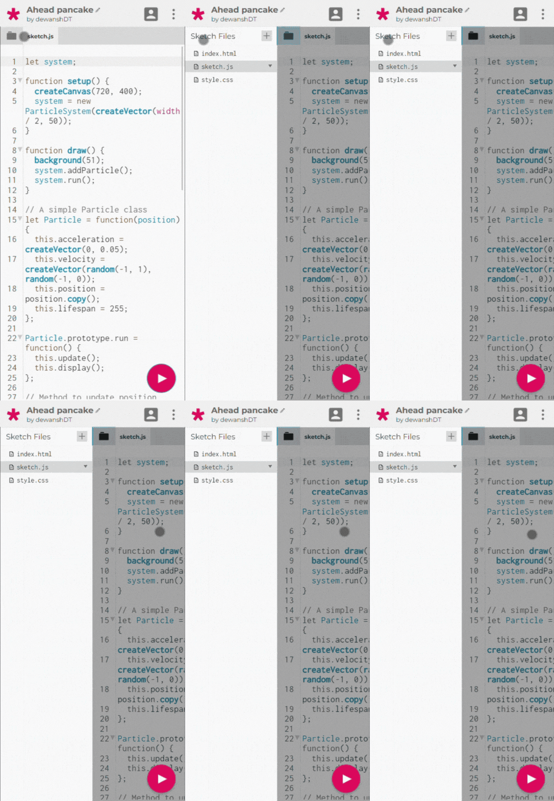
The SideBar, or the File drawer for the mobile was really similar to Shuju's designs, There were some minor changes here and there, but the way SideBar opens and closes in the mobile version was totally different in the mobile version. I created some wrappers for the sidebar component and also refactored the present SideBar component to make it useable in the mobile version too.
The Floating Action Button, for Running and Stopping the Sketch, Shuju’s designs suggested a Floating Action Button at the bottom so I made a new component for that and added it at the bottom right of the screen.
Pull Requests:
#2347 FloatingActionButton: added the component in smaller devices
Nav Bar and Tool Bar
The navbar and the toolbar in the current version are used for:
Menus like "File", "Account", etc
Running the sketch
Login and Logout
Changing the language
Changing the Sketch name
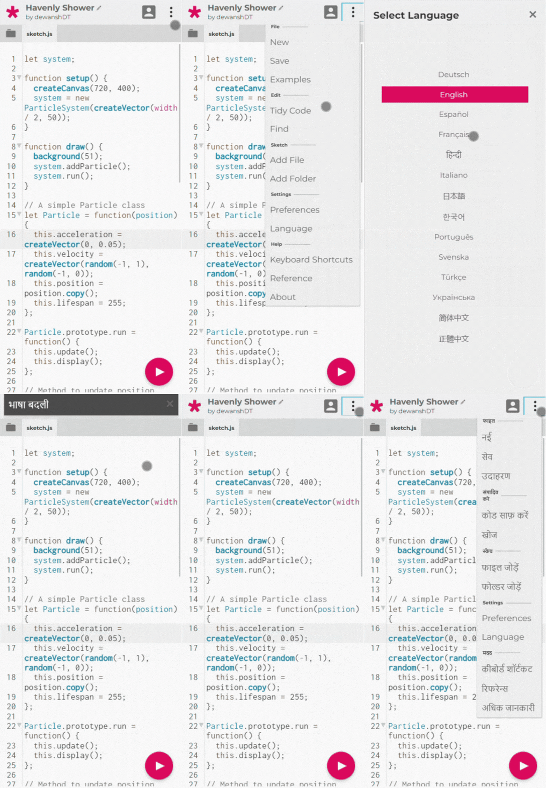
The project required the creation of an entirely redesigned navbar, intended to serve as a replacement for both the existing navbar and toolbar components. As part of this redesign, I decided to isolate the "run" and "stop" buttons within a separate component, which I will discuss in more detail later.
In terms of the mobile user interface, the navbar or header required specific features, which are outlined below for clarity:
Dynamic Page Title Display: The navbar should dynamically display the title corresponding to the page that the user is currently navigating, providing a contextually relevant user experience.
Page-Specific Menu Items: To enhance usability, the navbar should adapt its menu options based on the specific page the user is visiting. This ensures that users are presented with relevant actions and options depending on their current context.
User-Authorized Sketch Name Editing: In cases where user authorization permits, the navbar should offer the functionality to edit the name of the sketch. This empowers authorized users to manage and customize their project titles efficiently.
Custom Language Select: In order to select the language of the application the user has to use a drop-down menu which is good on bigger screens and even works well on smaller screens but a better I decided to go for a better option so I created a screen with an overlay to select the language, which turns out to be great.
Combined menus: The menus from the nav bar have to be combined in smaller screens so Shuju designed the drop-down menus that I then coded for mobile devices.
Additionally, I made the decision to centralize all the essential logic for editing, modifying, and saving operations into a dedicated hook called useSketchActions. This move streamlines our codebase by promoting code reusability across various components, eliminating the need for redundant implementation.
Determining the user's current page posed a unique challenge, particularly for pages with intricate URL patterns, such as "My Stuff," where the tab selection ("Sketches," "Collections," or "Assets") affects the URL structure. To address this challenge, I introduced a new hook called useWhatPage which detects the user's current page. This implementation opens up possibilities for future utilization in various contexts.
Furthermore, I refactored the Toolbar component from a Class component to a functional component. This change was prompted by the use of outdated and deprecated lifecycle methods in the previous version, which are no longer supported in React. This transition aligns with our broader effort to migrate to modern libraries and syntaxes.
Pull Requests:
#2350 New Nav Component and a new hook
#2352 Convert ToolBar to a Functional Component
#2361 Mobile Nav Component for smaller devices
My Stuff (Sketchs, Collections, and Assets Page)
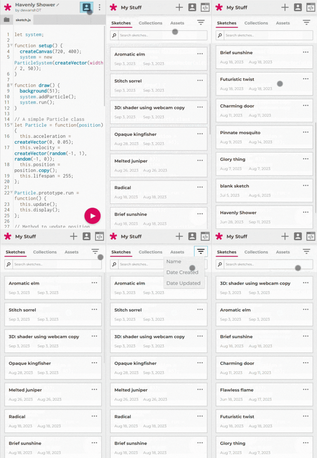
Now, let's turn our attention to the "My Stuff" page, which serves as the central hub for users to access their sketches, collections, and assets. This page incorporates three distinct tabs, one for each category: sketches, collections, and assets. Each tab presents a list view of its respective content. However, in its original desktop-oriented design, this page faced significant usability challenges.
To address these issues, I tried to focus on CSS changes as much as possible and used minimal javascript, as this is also good for performance. There were many changes but the main change was to convert the tabular list to a list of cards to show the items.
According to Shuju’s designs, it was required to add a button next to the tab switcher in order to filter and sort the items.
Pull Requests:
#2390 The My Stuff Page in mobile 🧸
Login, SignUp, and Account Page
The Login, SignUp, and Account pages shared certain similarities in their design and layout, they were useable on mobile devices and smaller screens but they just needed some small changes to look good on smaller devices.
Pull Requests:
#2400 Account Settings Page UI for mobile devices
Overlays and Modals
The editor's functionality heavily depends on the utilization of modals and overlays to present various menus, alert messages, and warnings. Presently, certain aspects, such as the "Settings" and "About" overlays, do not work very well on smaller screens. Therefore, the primary objective of this was to give the overlays and the modals a native mobile look and feel. This was achieved by expanding the overlay to encompass the entire screen and reconfiguring its layout to enhance usability significantly.
Pull Requests
#2346 Mobile Overlay fix: works on smaller devices
#2428 fix: Moda content overflow and Preferences height
Future Work and What's Left
The primary objective of achieving usability in the editor has been successfully accomplished and successfully integrated. However, there remains room for enhancement in specific domains, notably code sharing and the interface for incorporating user-contributed sketches into collections. Additionally, there are pending to-do items within the codebase that I have listed below:
Code Sharing Page
Add to the collection Page
For
MobileNav's title, instead of a switch, using props likemobileTitleAdding Language Translations in some of the newer components.
Moving the autosave feature to the
Editorcomponent, it is in theIDEViewcomponent.
The following are key areas that need to be addressed in the future. Furthermore, there is room for refinement in the editor as it evolves over time. I would love to continue contributing to this project and see how it unfolds.
My overall experience, what I learned
During this summer contributing to this project was a really good experience and I learned a lot since this was my first time contributing to such a large project. I also learned how to work in a team with my mentors, Discussing, planning, and executing things with them was something I had never done before since they were already working in the industry with real-world projects that people use, and I learned so much stuff.
For example, while working on the language switcher which was not present on the mocks, I had to make my own following Shuju's design language. The hardest part of the project was not coding, It was breaking down the stuff into smaller parts to merge in well-documented PRs, Linda came to the rescue and she helped me with this, She also provided really good feedback on each of my PRs and we made a lot of changes before merging so we do them as good as possible.
Conclusion
Over the summer, I accomplished and learned much more than I initially anticipated during my first major open-source contribution. This experience has grown my passion for open-source.
I want to express my gratitude to my mentors, Linda and Shuju. Linda provided me with support and guidance in the coding part of the project. Her expertise and patience helped me navigate complex challenges and expand my skills.
Shuju played a crucial role in enhancing the project's UI/UX, showcasing how design impacts user engagement. I'm really thankful for her insights.
This journey also highlighted the importance of collaboration, teamwork, and effective communication within the open-source community. Working with a fantastic group of individuals has been a rewarding experience.
Looking ahead, I'm excited to continue contributing to open-source projects and refining my skills. This summer has given me purpose and a desire to make meaningful contributions. I'm grateful for this opportunity, the mentorship, and the knowledge gained. Here's to more open-source adventures in the future!
