Implementing the Mobile designs of the p5* web editor
phase I (May 2023 - July 2023)
When I got selected in the Google Summer of Code for one of the projects by Processing Foundation, I got excited. The project was about enabling the p5 web editor to work across all mobile devices including phones and tablets.
The Community Bonding Period
I lucked out big time here because I had my end-semester exams all through May. During that whole month, we were supposed to chill with other community members and get cozy with the source code we were gonna work on. No actual coding until after May 29, which was when the coding phase kicked off. Luckily, I was already an active contributor to the web editor project, so I knew the source code quite well. All I had left to do was vibe with my mentors and other peeps in the community and appear for the exams.
I also got really good mentors, for UI/UX stuff I got Shuju Lin, and for the coding and tech stuff my mentor was Linda Paiste. They are the best! and helpful.
When the coding phase started ...
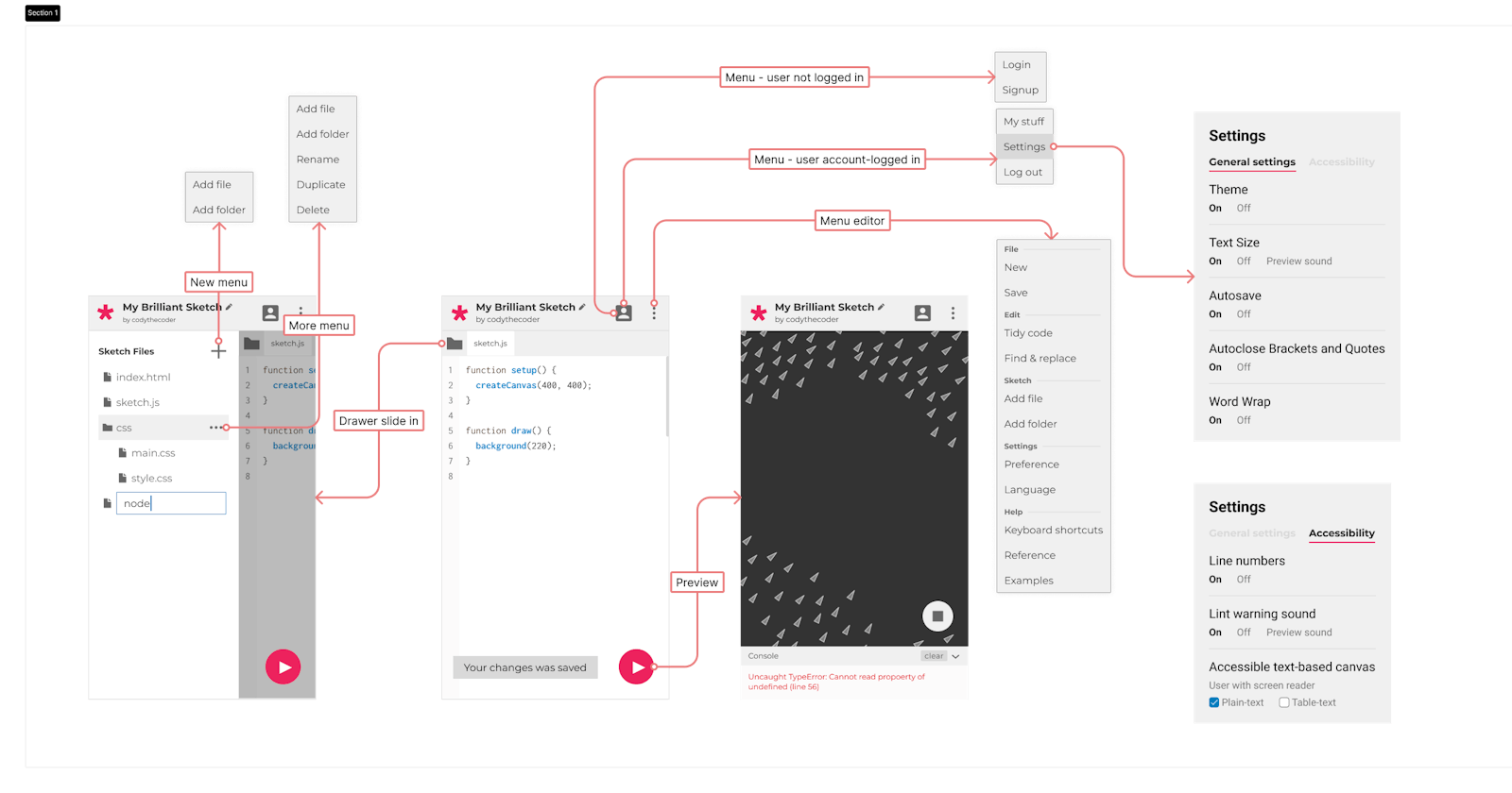
On May 29, the coding phase began and my exams passed with flying colors. I kicked things off by discussing the UI with Shuju and Linda. With Linda's help, I figured out how to dive into the coding part while also fixing small bugs and simplifying certain aspects. Although there was existing code for the mobile part, it wasn't functioning properly in production due to incomplete implementation. Consequently, I decided to start the mobile part from scratch, as I had a different idea in mind that didn't align with the previous approach.
There were several routes specific to the mobile version, but this approach wasn't efficient because transitioning from a larger to a smaller screen didn't yield the expected results in the editor's functionality. I aimed for similar routes for both the web and mobile versions of the editor, ensuring effective state persistence when switching between different aspect ratios. Instead of creating different components, my goal was to use the same component for both mobile and web versions in most instances.
We also had discussions and made revisions to the UI previously created by Shuju. Additionally, I decided to change the way the theme was implemented in the code, although it's still a work in progress.
Some components were implemented as class components, but since certain lifecycle methods had been deprecated long ago, I took the initiative to rewrite them as functional components, ensuring similar behavior.
To provide a more native feel on smaller devices, I created a simplified version of the header (Nav and Toolbar). Furthermore, I developed a hook called useSketchActions() to streamline the toolbar and all actions related to the sketch.
For the editor and preview to function properly, I had to render new instances of both <Editor /> and <PreviewFrame /> for smaller screens, along with wrapper components and conditional rendering. The sidebar or file drawer also needed to be redesigned, while utilizing the same <ConnectedFileNode /> component with some modifications. Additionally, the <FloatingActionButton /> was a brand new addition, transforming into a Play to Stop button when the sketch was already running.
All of these components retain their state when transitioning between various aspect ratios. Making the editor work with minimal changes was a challenging task, which I plan to optimize further in the program's second phase.
At present, I have most parts of the web editor working, which is more than I had initially planned to deliver before the first evaluation. However, the project was so captivating that I ended up investing more time into it. I am currently writing tests for the new versions of the components I've developed.
Apologies for not mentioning all the work I've done thus far, as I'm writing this a bit late. However, moving forward, I will be providing more updates on the project, so stay tuned...
Thank you for reading 😀
Check out the progress of the project here.
